I heard this morning from a friend in our Cameroonian church that there was news that things would start to open up soon, so they were starting to make plans on how to do that at church. This surprised me, and since I haven’t looked at the stats for awhile, I did so today, and was surprised by what I found.
First of all, there are a few things I look for. As we talk about flattening the curve, one thing I look for is the shape of the curve, and where we stand in that shape. Is the increase linear, or exponential? Is the increase decreasing, even if the over all numbers are still rising? The other main thing I look at is how longstanding the trend is. There were many days where I wasn’t sure what to make of the numbers for Cameroon. Were we seeing a new trend, that was only a few days old, or a glitch in the numbers/reporting? There were several times where there were few/no numbers reported, then a few days later, the stats caught up. So it is helpful to see data work out over a week or two, to be able to extrapolate past dramatic shifts of a day or two, that represent reporting irregularities more then pandemic progress.
So, here is some of what I found, at https://www.worldometers.info/coronavirus/ (spoiler: pretty much all good news for Cameroon):
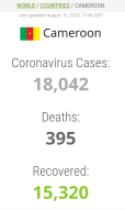
This stat is a nice one, because it allows a quick overview of the situation, and a quick comparison of how many total people have been sick, and how many of those have already recovered (as well as how many have died). For instance, this set of numbers shows a large proportion of those who have or have had COVID-19 have recovered (15k/18k = ~83%), and a very small proportion have died (395/18k = ~0.21%). So this is a good thing for Cameroon. But I’m sure not everyone reading this is into numbers.…
So this one shows the total cases in Cameroon:
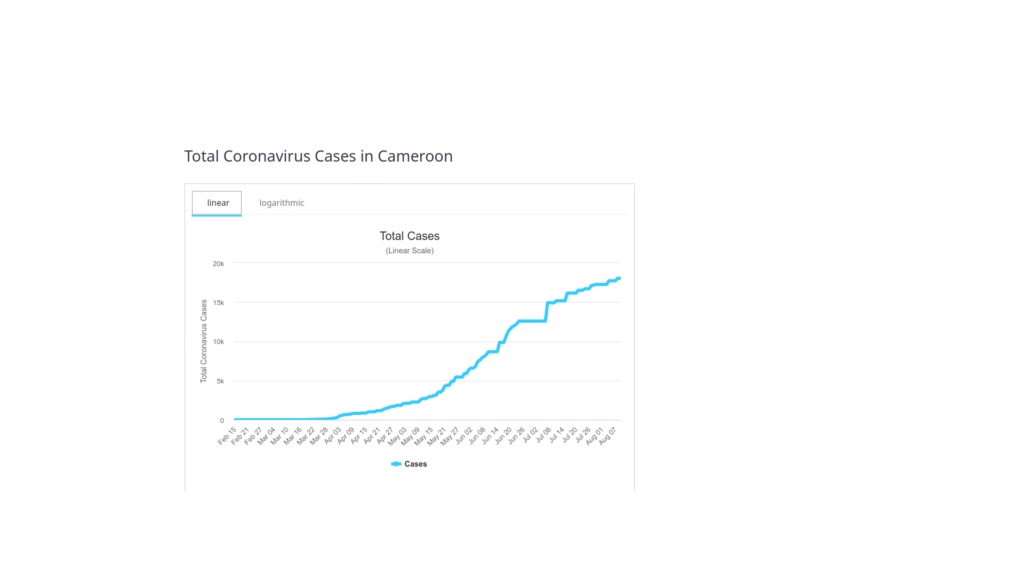
As you can see, the curve is clearly flattening. There is the section where the curve was exponential (up to maybe June 1), then it straightened to a line (up to maybe July 14), and now it is leveling off. But that’s not all:
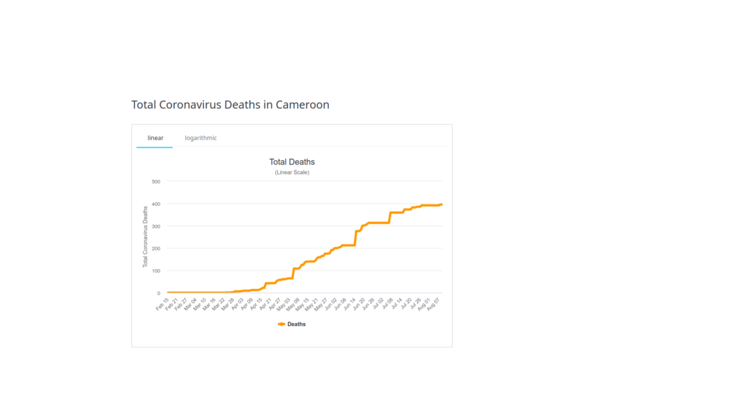
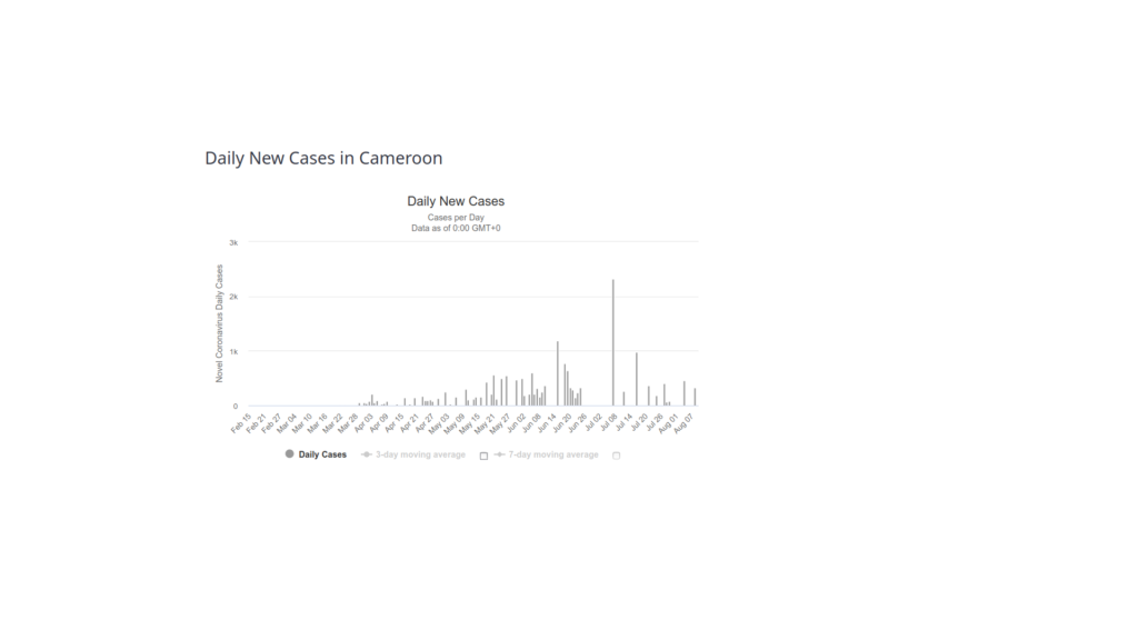
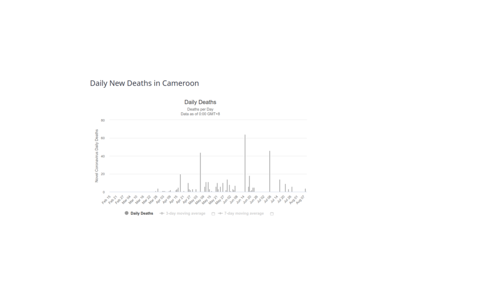
So we see the same thing here, that the number of total deaths is also leveling off, and may not go much past 400 total deaths. Yay! We see a similar thing for new cases:
As well as for daily deaths:
The above graphs can be summarized in the number of active cases over time:
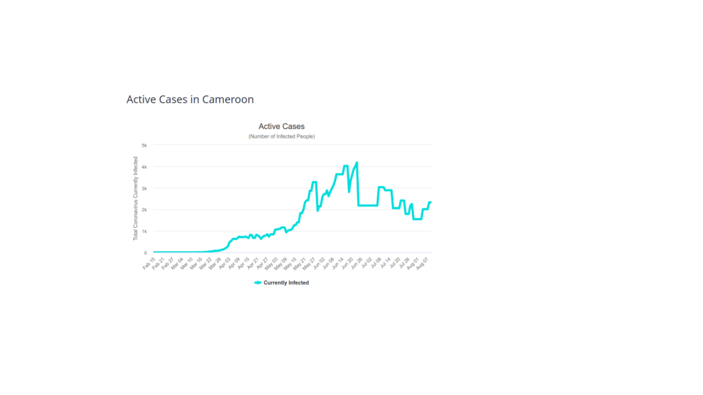
That is, the number of cases at one time was stable at about 1,000 cases for some time (through April), then went up to as high as 4k cases (May-June). It is now back down to about 2k cases (and falling), meaning people are now recovering at least as fast as people are getting sick.
Comparison with other places
In case the numbers and graphs don’t mean much to you, I also found the same data for other places, for comparison. This is the total looks like compared to in the US, with a red and blue state (each where we know and love people) for comparison:
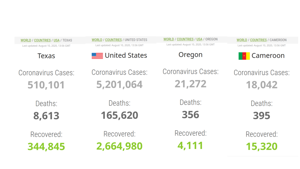
That is, whereas in Cameroon there are some 83% of cases recovered, in the US generally, there are almost half of the cases (that have ever been, 2,664k+165k)/5,201k =~54%) still active. Sick people still producing virus, potentially still infecting other people. The ratio of recovereds in Texas is slightly better than average (345k+8k/500k = ~70%), and in Oregon much worse (4k+0.36k/21k =~20%). Recall that the purpose of these ratios is just to understand where on the curve we are. In Cameroon, we are on the back side of the curve, with fewer and fewer cases. In the US, we are still at the middle or nearer the front of the curve.
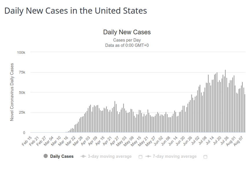
The daily new cases in the US looks like it is nearing the back side of the curve:
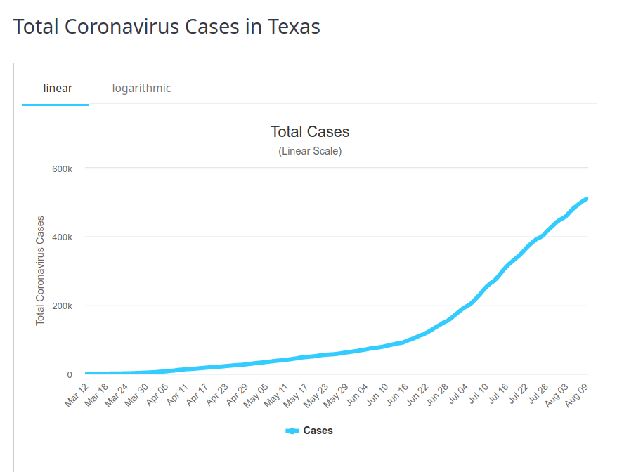
And maybe so for Texas
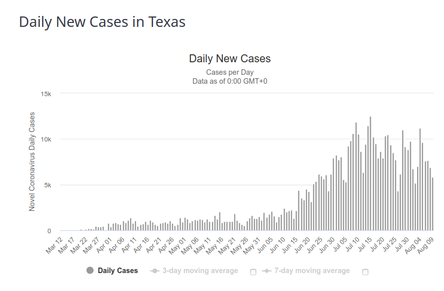
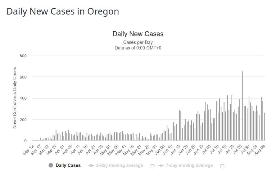
And for Oregon (though less clearly so):
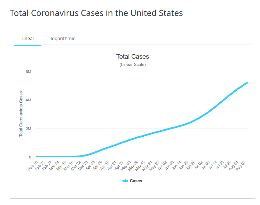
For total cases, the US seems more clearly not flattening:
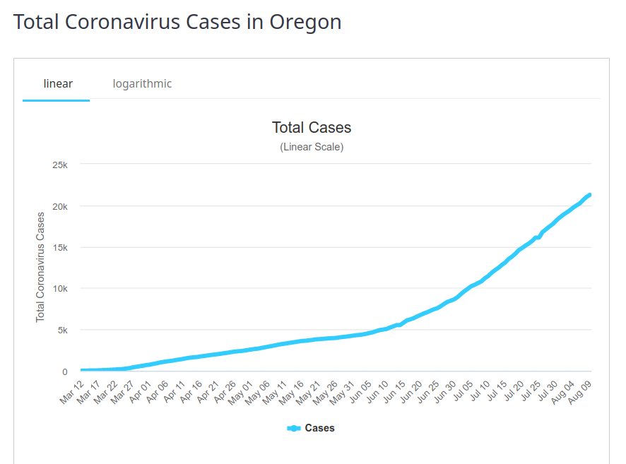
and the same is seen in Oregon and Texas (maybe flattening a little here):
Anyway, if you want more stats than these, or if you want to see how they are when you’re reading this (since things change), or how they are in your state, county, or country, you can find all that at https://www.worldometers.info/coronavirus/ (including data showing the resurgence in France, which last I had seen was on the back side of the curve!).
The bottom line is that, compared to other places, Cameroon is a pretty safe place to be these days, with regard to COVID-19.

This work by Kent is licensed under a Creative Commons Attribution-NonCommercial-ShareAlike 4.0 International